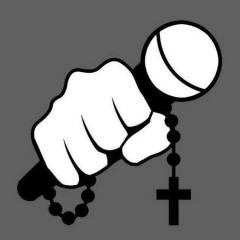
dUSt Posted August 24, 2005 Posted August 24, 2005 This is just a very rough draft. These won't even be the same image use for the turntables. My tables will have monstrances on the record mats. What do y'all think? It's staying with the same artistic theme as Massmatics.
dUSt Posted August 24, 2005 Author Posted August 24, 2005 This is just a very rough draft. These won't even be the same image use for the turntables. My tables will have monstrances on the record mats. What do y'all think? It's staying with the same artistic theme as Massmatics.
flip Posted August 24, 2005 Posted August 24, 2005 needs a rosary or something more catholic... no one is gonna get the monstrances... unless its in the middle of the picture
ryanmeyersmusic Posted August 25, 2005 Posted August 25, 2005 i think just "aftermass" in script would be cooler. the ___ project has kind of been played out, imho
ryanmeyersmusic Posted August 25, 2005 Posted August 25, 2005 do like the overall feel, though. whitespace is your friend
Paladin D Posted August 25, 2005 Posted August 25, 2005 Is it an invisible cover, or is it just not there?
Paladin D Posted August 25, 2005 Posted August 25, 2005 Have the turntables on the bottom where they are, but have a monstrance in the center with the words glowing "The Aftermass Project".
KnightoftheImmaculate1 Posted August 25, 2005 Posted August 25, 2005 glowing effect is old and over used, so I would stay away from that. Try Gothic fonts. Like the turntables. Servvs
ryanmeyersmusic Posted August 25, 2005 Posted August 25, 2005 you have to click the little clip thingee on the board... weird...
ryanmeyersmusic Posted August 25, 2005 Posted August 25, 2005 [url="http://www.phatmass.com/phorum/index.php?act=Attach&type=post&id=2376"]http://www.phatmass.com/phorum/index.php?a...pe=post&id=2376[/url]
ninjakyle Posted August 25, 2005 Posted August 25, 2005 i think its great i could go either way on the "project" good work
HomeTeamFamily Posted August 28, 2005 Posted August 28, 2005 i agree about the whole "project" thing....i like aftermass better.....nice font though and i like the over all image
heavenseeker Posted August 29, 2005 Posted August 29, 2005 [quote name='flip' date='Aug 24 2005, 06:14 PM']needs a rosary or something more catholic... no one is gonna get the monstrances... unless its in the middle of the picture [right][snapback]697674[/snapback][/right] [/quote] Flips right dude
Seven77 Posted August 29, 2005 Posted August 29, 2005 drop "project" if you want. bigger and bolder font for "Aftermass".. a solid sans serif font. like its coming at you.. and then the white space wont seem like anything is missing. def. have the Eucharistic theme...i feel your plan--its dope: Massmatics cover reflected the Year of Rosary, Aftermass for Year of the Eucarist!
Recommended Posts
Create an account or sign in to comment
You need to be a member in order to leave a comment
Create an account
Sign up for a new account in our community. It's easy!
Register a new accountSign in
Already have an account? Sign in here.
Sign In Now